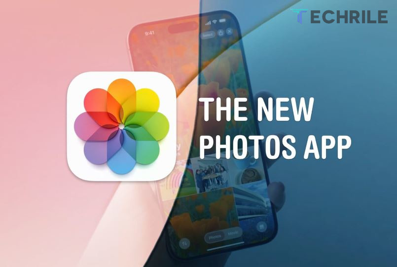
“It keeps your library organized and makes it easy to find photos without needing an elephant’s memory,” “it puts everything at your fingertips,” and “you’ll spend less time searching and more time enjoying your memories.” This is how Apple describes one of the main new features of iOS 18 on its website: the redesign of the Photos app. The company has completely changed the interface by removing the tabs that were previously at the bottom and grouping everything on a single page to provide a more intuitive experience.
However, after several months of testing iOS 18, I have concluded that the new Photos app is anything but intuitive. In fact, it’s a disaster and probably the worst change to the iPhone operating system since the Safari redesign in iOS 15, which Apple thankfully managed to fix.
Even today, right after the week since the official launch of iOS 18, I still haven’t gotten used to the new app. The learning curve is incredibly steep compared to Apple’s other apps because practically nothing is where it was before, and nothing is where it should be now.
iOS 18 Photos App: How to Ruin Something That Already Worked
Let’s discuss the changes. The new interface of the Photos app in iOS 18 now occupies a single page. Everything is located in one place, including recent albums, the favorites section, and hidden and deleted photo folders. You can access each section through gestures: by swiping up, you can see all the photos and videos in the gallery, which opens a small menu of tabs to browse by month or year. There is also an option to sort them by date added or captured.
As you scroll down, you’ll find different sections that are activated by default. One of these is called “Recent Days,” which allows you to view images and videos captured or stored by day. Just below this is the albums section, which was previously available as a single tab. This section only shows the albums that the user has created manually.
This means that the favorites album in the iOS Photos app does not appear here. Instead, it is displayed only in another section called “Pinned Collections.” You can access the photos and videos marked as “Favorites” by swiping up in the app to see all photos, using the drop-down menu to search by date, tapping the arrow icon on the left side of the screen, then tapping the “Filter” button, and finally clicking “Favorites.”
In other words, what used to take two steps now takes five. It took me weeks to figure this out for an app I use every day.
In addition to the sections mentioned above, there are other categories crowded together on the home page of the iOS 18 Photos app. These include a section for travel, one for people and pets, a section for featured photos, and, of course, a section that allows you to search by content type (such as videos, selfies, and live photos). There’s also an ‘Other’ section where you can access hidden images, recently deleted photos, or duplicate images.
Redesign Needs A Redesign
There are some positive aspects of the new Photos app in iOS 18. I can’t deny that it looks visually appealing: albums feature new animations, and the icons have a style similar to what we see in visionOS.
Apple has also made the Photos app in iOS 18 more customizable, allowing you to remove and rearrange sections of the home screen and improve search options, which was not possible in the early betas. The issue is that it shouldn’t be the user’s responsibility to simplify and improve usability; by default, the app should be simpler and more minimalist. Additionally, there’s no way to revert to the previous navigation tabs that made accessing different albums much easier.
In my opinion, Apple should never have removed tabbed browsing in the Photos app in iOS 18. Instead, they should have eliminated unnecessary sections, like the “For You” section. I don’t want the app cluttered with “smart” features that remind me of a time when I stopped at a gas station in Móstoles two years ago and took five photos and a video of my brother doing a handstand. I prefer to see my albums and favorited photos before any other section.
There’s no doubt that the redesign of the Photos app in iOS 18 needs another redesign or at least a return to a slightly improved previous design. Apple can do what it did with Safari: roll back the changes and restore everything to how it was. Alternatively, they could give users the option to choose between tabbed browsing or a single-page layout.


